Website Functionality and Efficiency
The Mount Vernon School
The Mount Vernon School
The Mount Vernon School
User Research | Campaign Management | Functionality | Testing | UX/UI Wireframing | Data Analysis | Graphic Design
Need
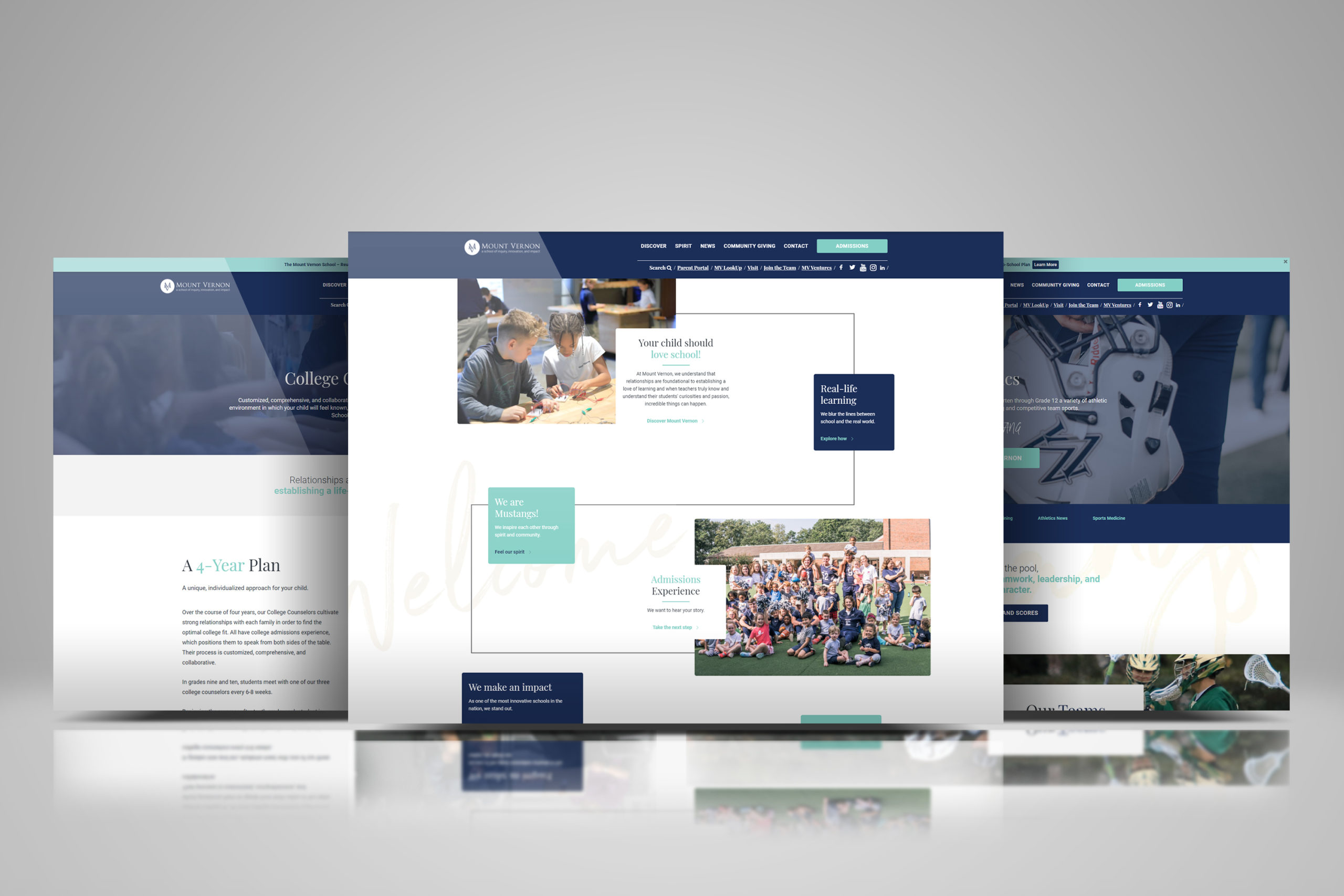
Using CrazyEgg and Google Analytics I recognized, then showed the need for sweeping changes to improve user flow. The school had been convinced to go minimal and “fashion over function” to create a “clean” site, however this new site didn’t answer customer’s questions and/or created frustration.
Focus 1
Forced pass-through pages and The Infinite User Loop
Several sections of the website required a user to “know” how to get there. Ex – to find “Middle School” information, a user needed to access the “Discover” page, then find the on-page link to “Middle School”.
To learn about “Athletics/Arts/Spiritual Life”, a user needed to click the “Spirit” page, which defaulted to an Athletics page with on-page links to Arts and Spiritual life (it was a mess but it was “pretty”).
Focus 2
Website was missing content that was either
A – often asked about by parents
B – considered revenue generating
Focus 3
Compared to competitors, website felt static and was missing dynamic components.
Solutions
Created streamlined functionality to guide users to their direct inquiry.
Created dedicated pages for highly sought after content.
Restructured existing pages to update messaging, remove ineffective content, and highlight programmatic details.
Implementation of video heroes, and detail cards.
Roles
Strategy/prototyping – user flow maps/wire-framing
Interviews/Consultation
Copywriting/editing with multiple collaborators (either to reframe for consistent messaging or to propose alternative language).
Personas – 2 of 5 Target Market Personas used in editing website and marketing materials.
Project Focus
Project Focus
Fashion over function Pt. 1
AKA “The Infinite User Loop”
Problem
Access to specific grade level and department pages was hidden behind forced user flows and unknown link paths. The website was essentially a scavenger hunt.
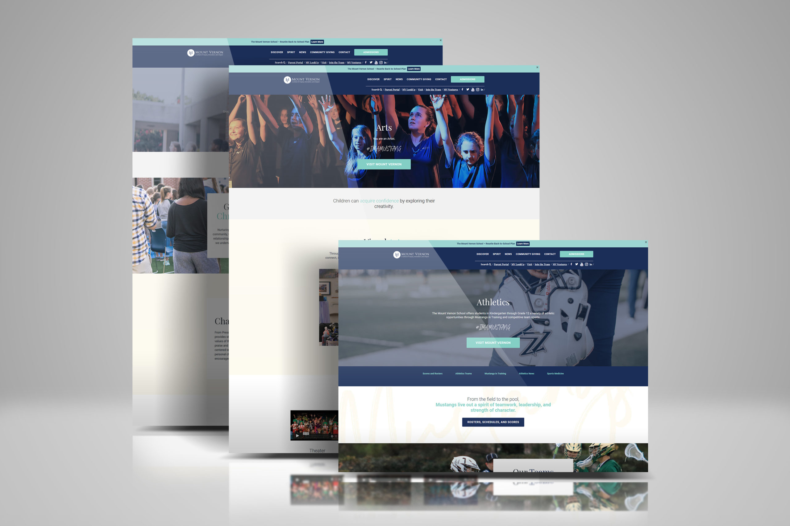
Example: Athletics, Arts, and Spiritual Life pages were accessed by clicking the header link “Spirit”. I lobbied that this was misleading and required the user to “know” internal language.
Old User Flow: Access “Spirit” Page -> Takes user to page page with “/athletics” URL -> on page links require user to select Arts/Spiritual Life to navigate to those pages.
Grade Level pages required first accessing the “Discover” page in the header. A user could not simply jump to say, The Upper School page.
Solutions
By studying CrazyEgg and Google Analytics I showcased the ongoing user loop: website visitors were trying to find a dedicated department pages but the site was unable to provide the solution quickly. The previous web build tried to funnel users to landing pages that contained multiple internal links to launch the user. Pages were trying to do too much and therefore were lacking detail, users were left in the dark, and footer nav was inaccurate.
Consulted with various departments to create independent, mission focused pages to highlight individual programs. Incorporated a drop-down menu function on the website to guide users through minimal clicks.
Outcomes
Traffic to “Athletics” page dropped and traffic to “Arts” and “Spiritual Life” pages increased (as expected – “Athletics” was normalized).
Drop-down menus were incorporated under the Discover link to guide users causing traffic to specific department pages to increase.
Project Focus
Project Focus
Fashion over Function Pt. 2
”Clean” ≠ Effective
Problem
Perspective families couldn’t find the two most sought after pieces of information: Course Catalogs and College Counseling.
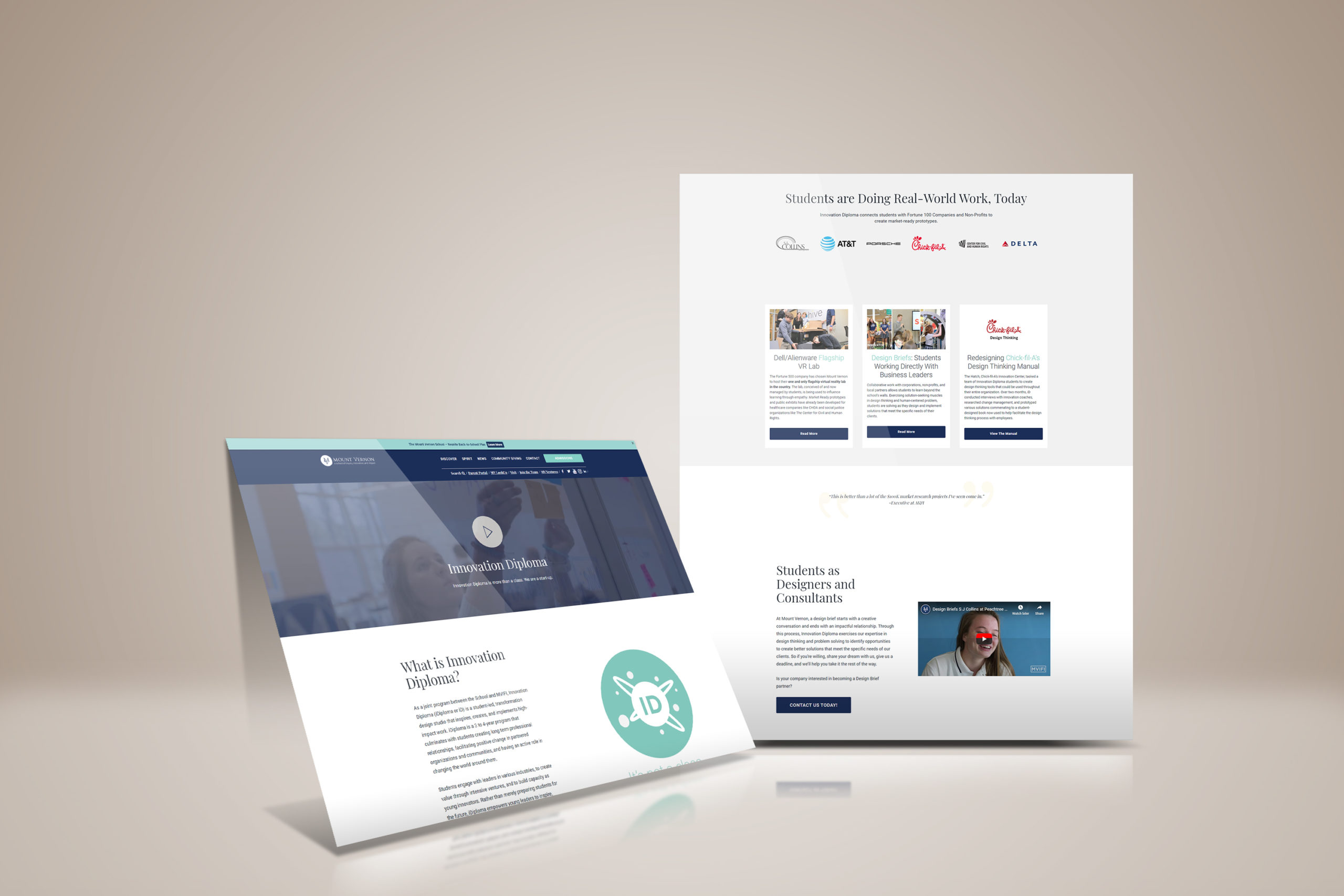
The school’s “Most Celebrated Program” – iDiploma, didn’t have a landing page and therefore the program had gone rogue and built it’s own third-party site, unconnected to the school webpage.
Process
While running my initial website audit, I interviewed the admissions department to understand what prospective parents ask for the most. The answer was: “Where can I learn about the College Counseling Program” and “Where can I find the Course Catalog”. I learned it had been determined to remove this items from the website rebuild so as not to clutter the site.
While analyzing competitor schools, I found this information is often easily accessible and celebrated.
Solutions
Consulted with College Counseling and Admissions departments to design content and dedicated pages.
Outcomes
Created a significantly more streamlined experience for parents.
Reduction in wasted time and redundant conversations for Admissions and College Counseling as both departments were able to better and more efficiently communicate details to families, families were able to know more before calling.
Removed a lot of headaches.